Task analysis
There were multiple tasks and user stories to consider so for time constraints I limited myself to a few so now to get lost in creating a full working app
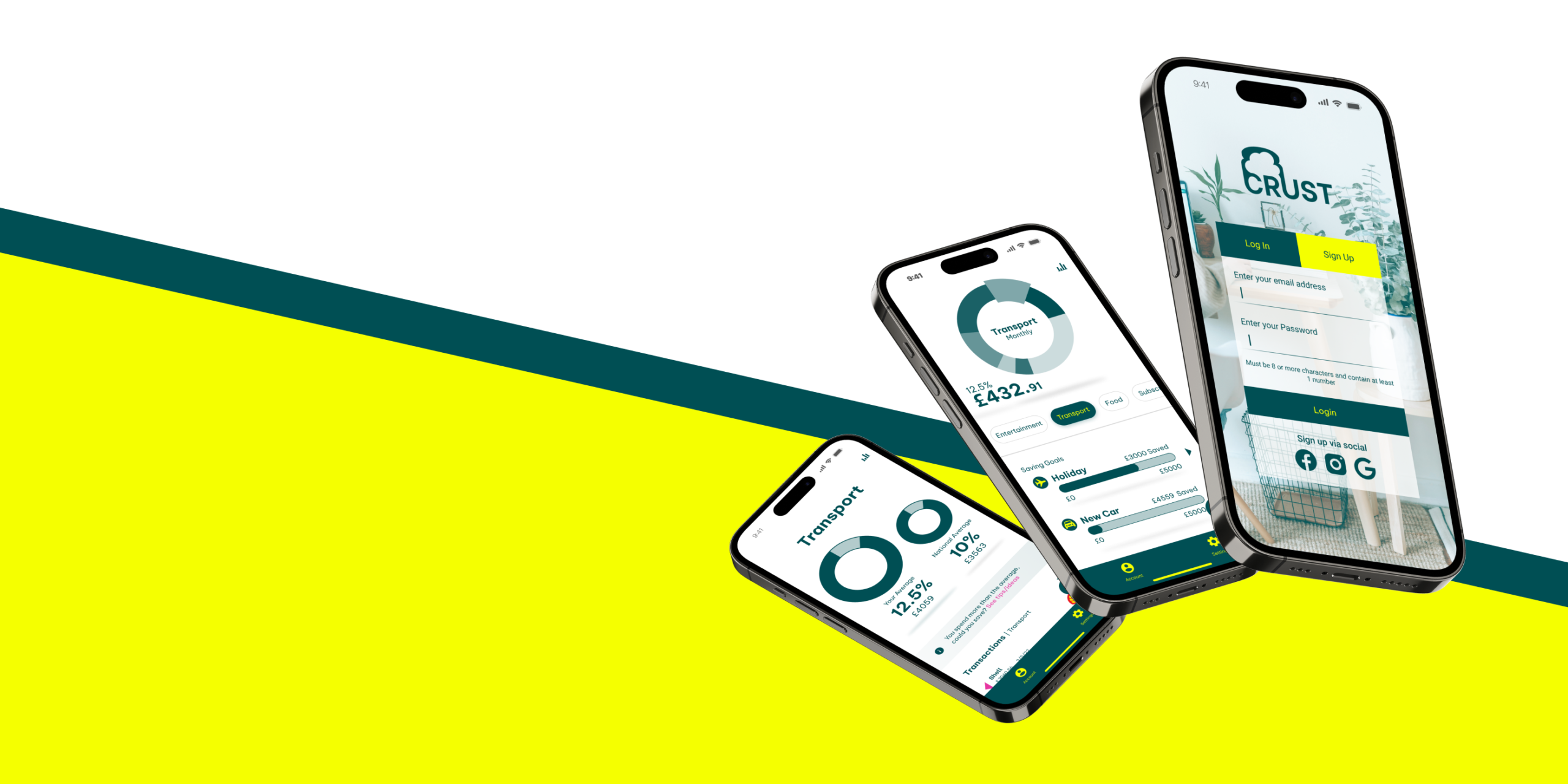
Brief
Design a money saving app for users who want to save money, quickly, for a particular reason.
Broken into 2 parts, firstly:
Design the branding
Secondly:
Design the app.
The users are not new to technology but do not like working with their
finances. So, they require that the information they receive via the tool is accessible, and clearly tells
them what they can do to better save
Branding
The first part of the brief was to generate a branding guidline kit for the app which I named crust as in earning a crust and then linked the letters to
C – clarity
R – reliability
U – usability
S – simplicity
T – trust
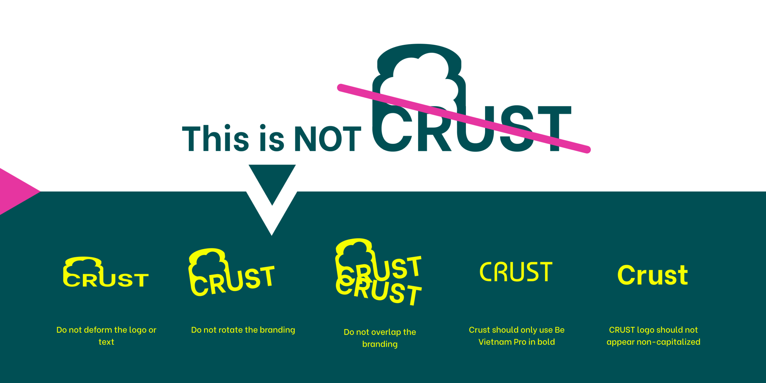
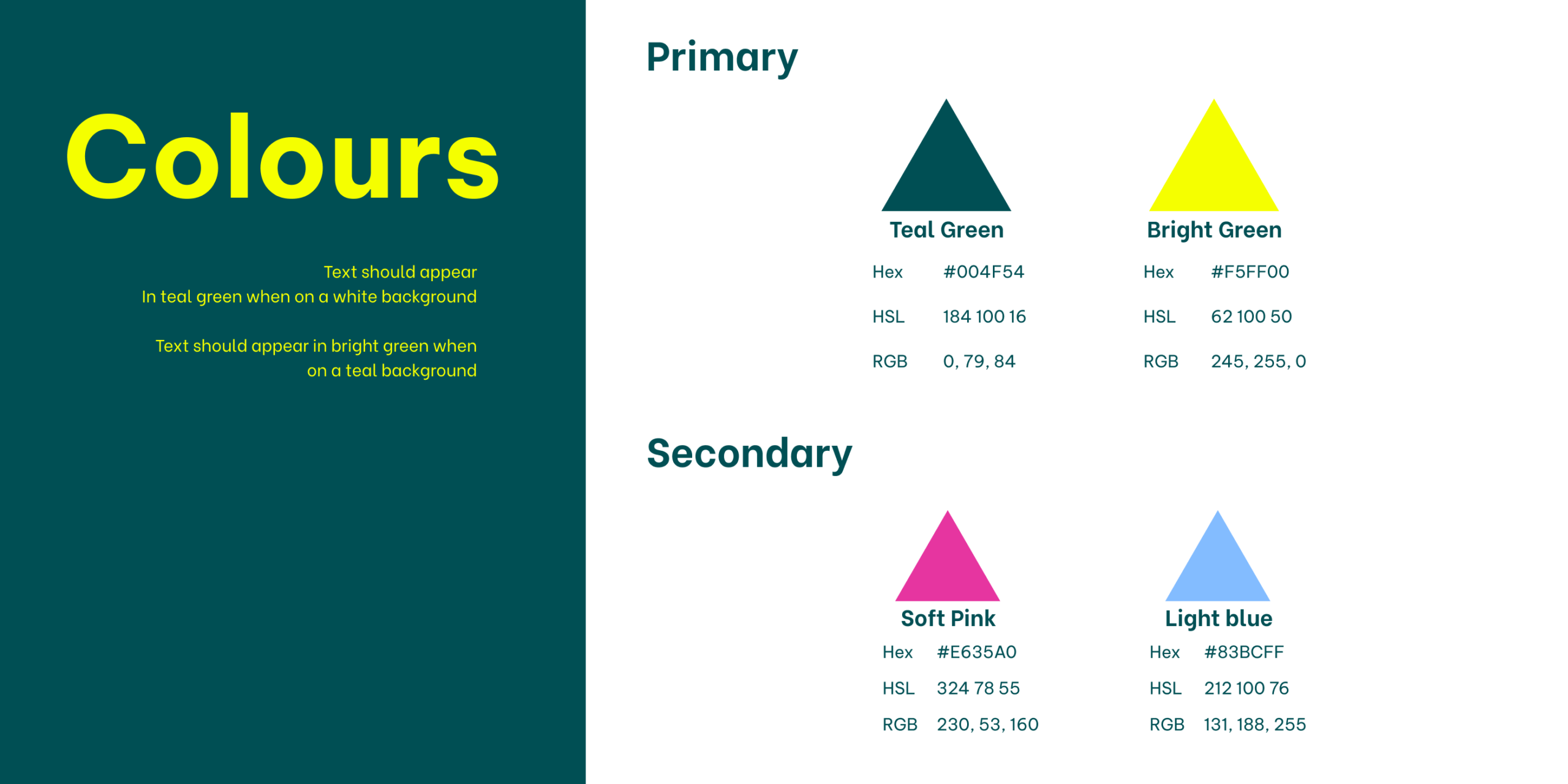
You can download the guidelines here and check out some graphic design skills while you are at it
Planning
Moving on from the branding guidelines I tackled the design tasks and requirement assessments form the users.
There were multiple tasks and user stories to consider so for time constraints I limited myself to a few so now to get lost in creating a full working app
After taking the user stories and pulling out a few I began to construct some user journey's to determine how the user would be expected to navigate their task
In the most basic form I sketched out screen designs and differnt ideas for data communication
From the sketches I turned my designs into the figma wireframes to determine the rough layout of the functions before colour was applied
With the wireframes I was able to test the design and get feedback on what people thought of my initial direction
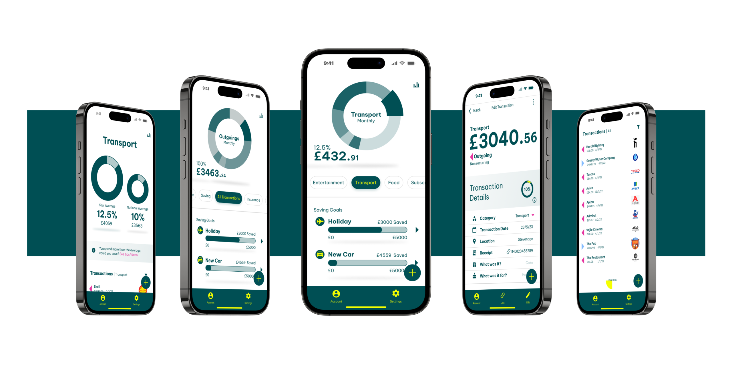
Taking the feedback onboard I went ahead and createing high fidelity design with colour so I could run more tests
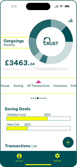
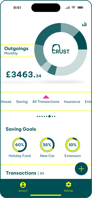
With the near finsihed design I was able to run some preference testing on some areas of the design that I was unsure about and got useful feedback for imporving the design
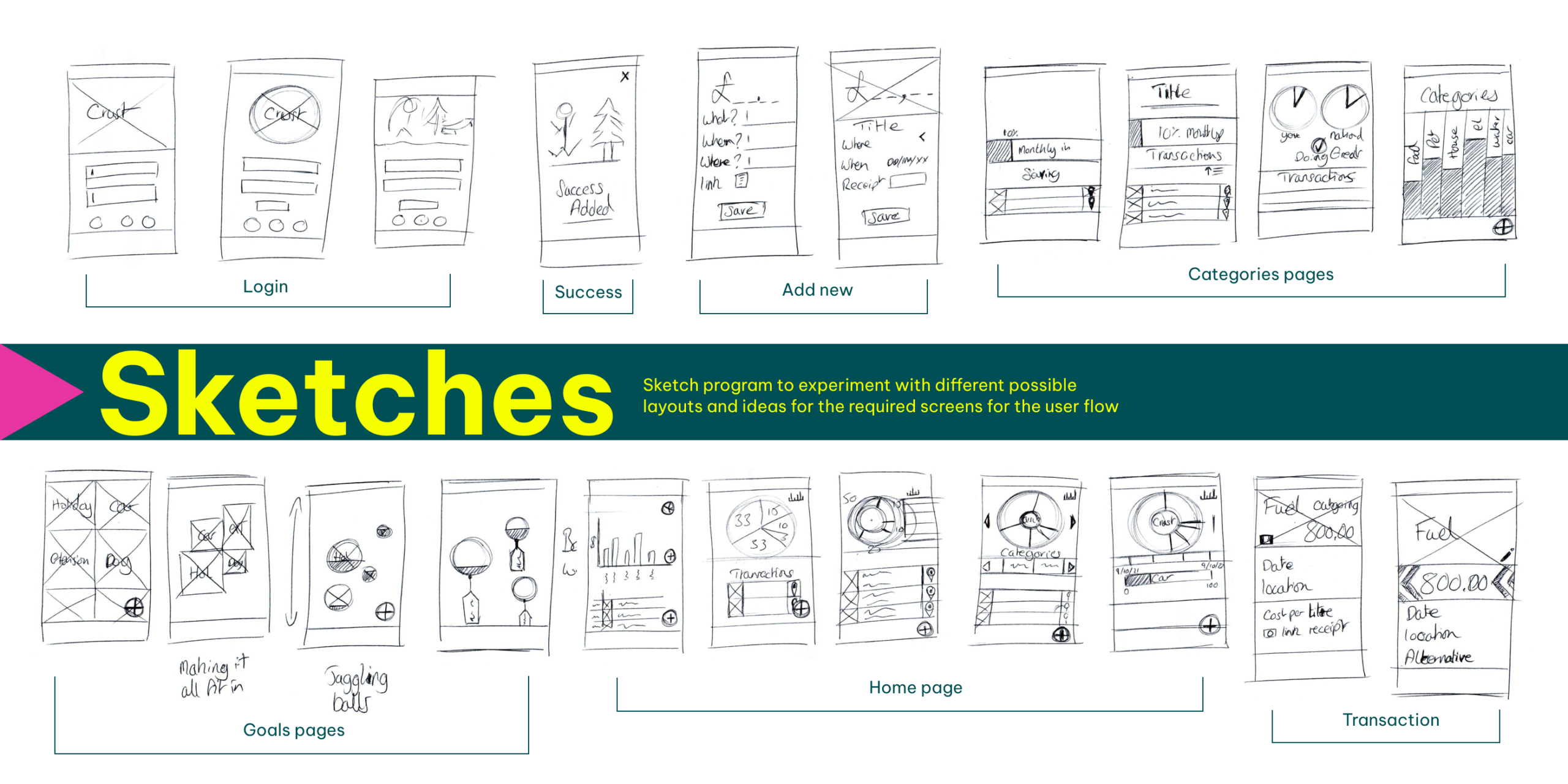
Initial designs
With such a short project brief there was no time to do much ground research as this was more about a design excercise than a research one. As a result I went quickly into sketching ideas to establish a basis to work from in Figma
Mock ups
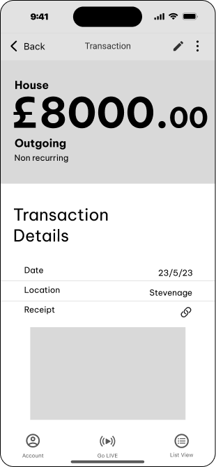
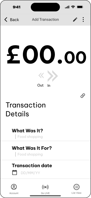
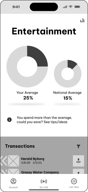
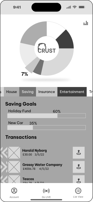
Feedback

Takeaway - Revisit the horizontal slider and try to make it more obvious that is slides
Insights
Takeaway - Reduce visual complexity of the pages and spread out the information provided
Insights

Takeaway - Avoid duplicating buttons, look at way to identify categories easier
Insights
Testing
Outcome
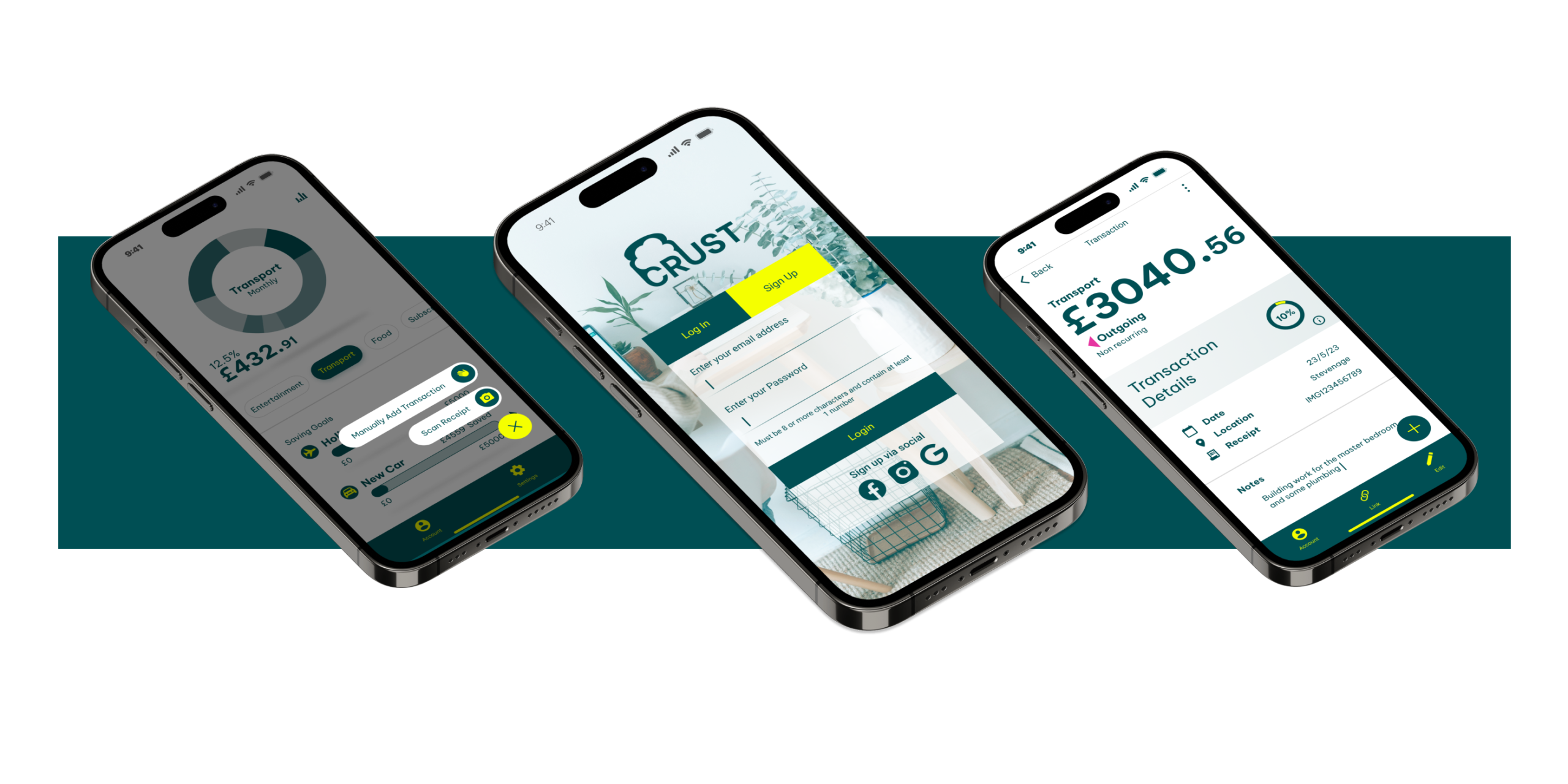
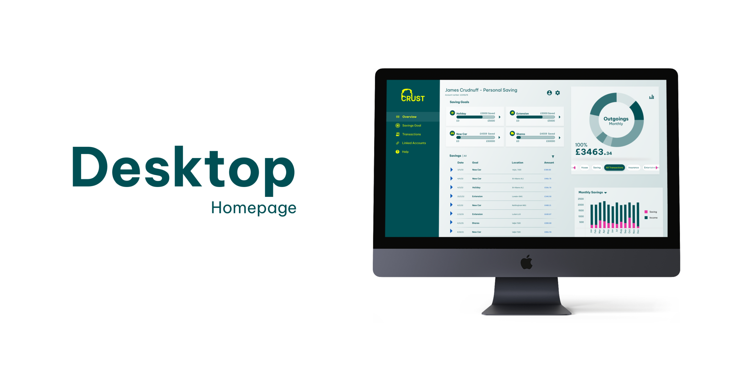
With the preference testing done the design was ready for final UI tweaking and delivery. I used the input given in the test and made some further modifications to increase the contrast and reduce the visual strain of the bright colours
Delivery
Currently available for freelance opportunities and creative partnerships worldwide. Let's build something exceptional together.