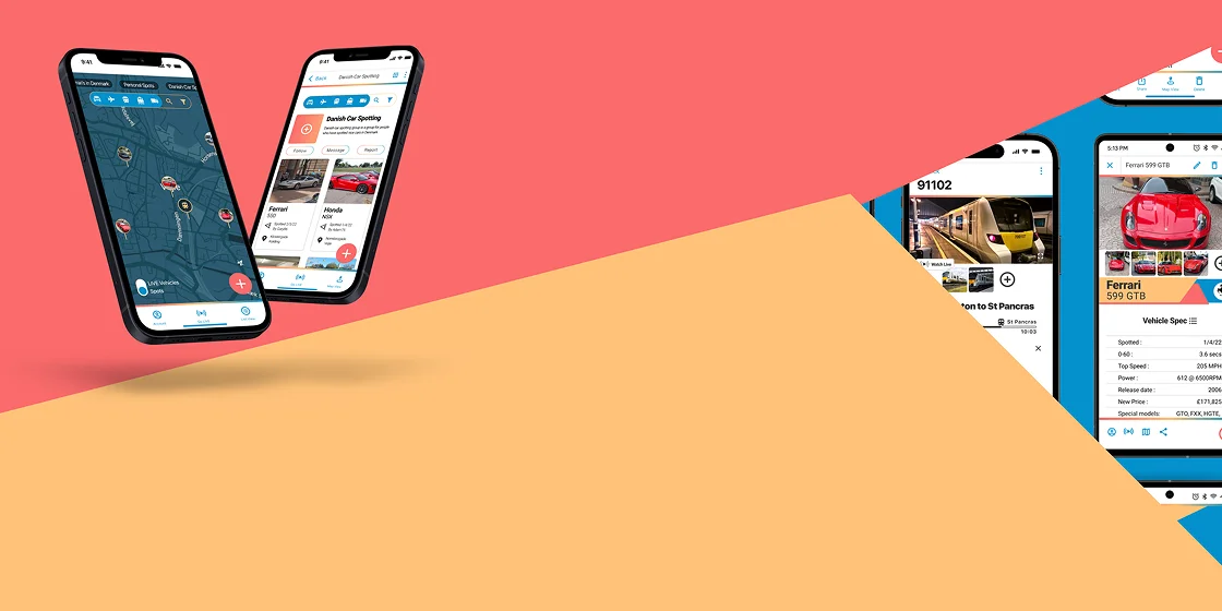
01 / Overview
Project description
Spotted var et projekt, jeg tog fat på, mens jeg fik officielle kvalifikationer til UX/UI hos Career Foundry. Opgaven var at lave en app selv, noget der i dag ville være meget nemmere med AI, men jeg gik tilbage til min ungdom og digitaliserede de bøger, jeg plejede at elske om bilture, hvor man skulle optage sjældne biler, man havde set.
‘Design a native app that solves a user specific problem’
— — Project brief statement
02 / Market Analysis
Competitor Research
| App name | Flight 24 | Spotting trains | Car spotting by Motorhead | Car spotting radar |
|---|---|---|---|---|
|
Description
|
App for tracking aviation. | App for recording sightings of trains. | App for recording sightings of cars. | App for recording sightings of cars. |
|
Features
|
|
|
|
|
|
Target Audience
|
13-65 anyone with an interest in plane, typically and more mature audience. Also just interesting to see what flying above. | 40-70. Typically trains spotting is a UK based past time and was most popular with kids pre 1980 so the older generation is more likely. | 8-35. From kids to big kids. | 8-35. From kids to big kids. |
|
User Experience
|
Great, app works well and smoothly. It is logical and doesn't let adverts get in the way of the experience. | Terrible! I was not able to access the app. After going through the full intro i was asked to login/signup and the told I couldn't because I needed a golden ticket. No explanation, very frustrating. | I don't know because although it was meant to be available for download it wasn't. All the info I have is from a slick website they produced. | Terrible! full of spam, long adverts in between stages, no sightings, bad UI, Terrible design aesthetically and UX. |
‘Design a native app that solves a user specific problem’
— — Project brief statement
03 / Design Analysis
User feedback
We utilized a strict 12-column grid system to ensure visual consistency across all touchpoints. For typography, we selected ‘Inter’ for its exceptional legibility and neutral character, allowing the brand’s content to take center stage.
- Show a variety of vehicle sighting opportunities
- Have vehicle specs
- Have groups
- Have share features
- Have auto vehicle recognition
- Be useable in some form without login quickly
- Be simple and logical to a wide age range
- Be fun
- Show sighting on a map along with others
- Alert user when sightings have been logged in an area
- Show vehicles live on the map
- Show vehicle route
- Offer a good selection of images
- Have a journey route/progress bar
- Have relevant and clear filters
- Harmonious revenues stream that doesn’t interfere with the User experience
- Do what it says it will do and not frustrate users
04 / Design Phase
Low fid screen mockups
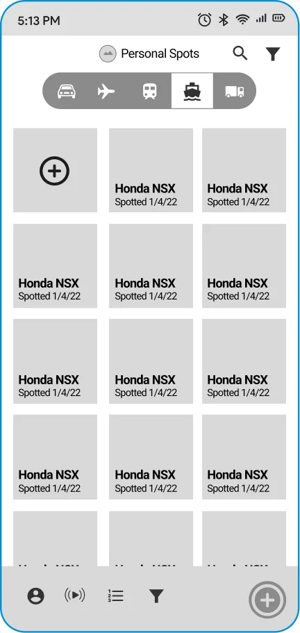
Screen 1
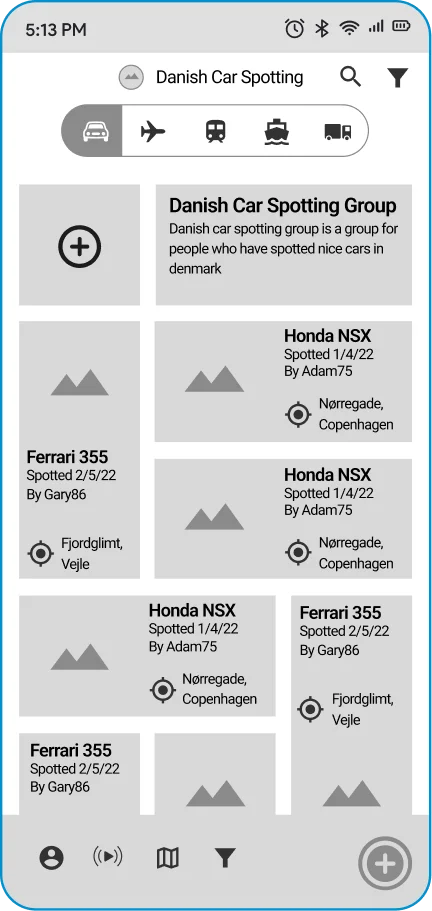
Screen 2
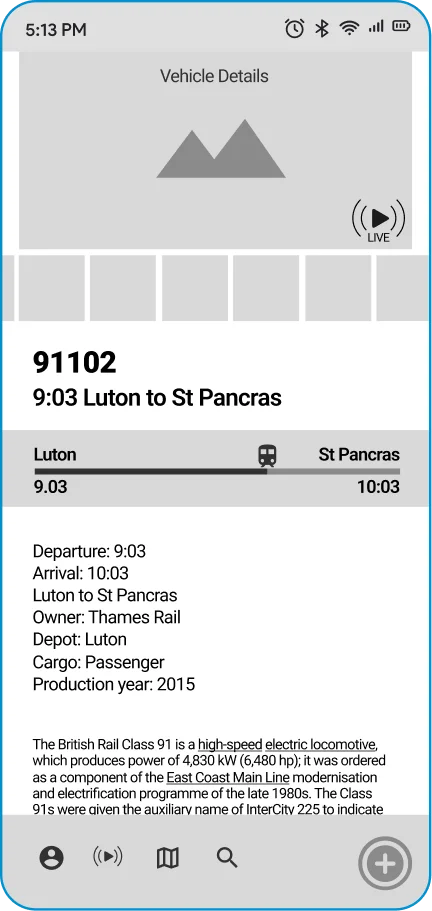
Screen 3
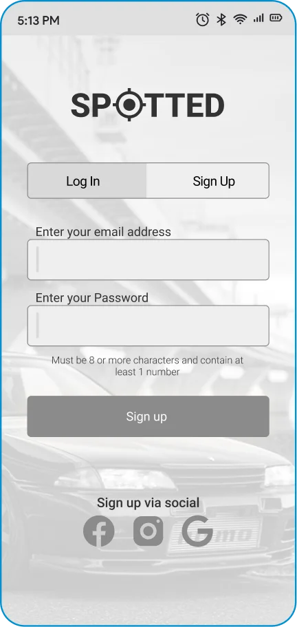
Screen 4
05 / Branding
Logo design
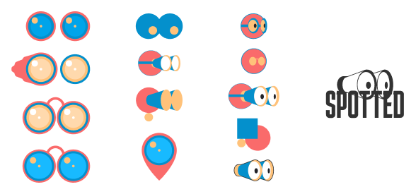
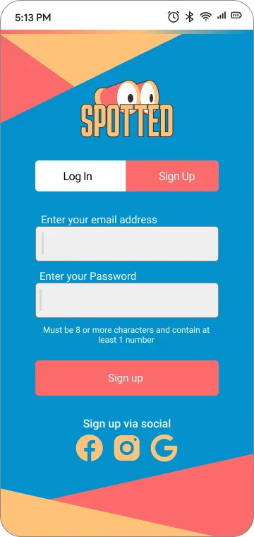
With layout and features established the visuals could be approached and central to them is branding. The logo was inspired by pair of binoculars which I wanted to simplify and characterise to capture the playful nature of the app
06 / Design phase
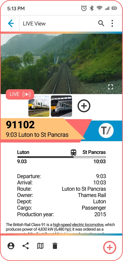
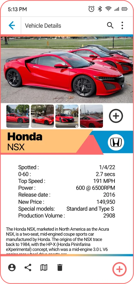
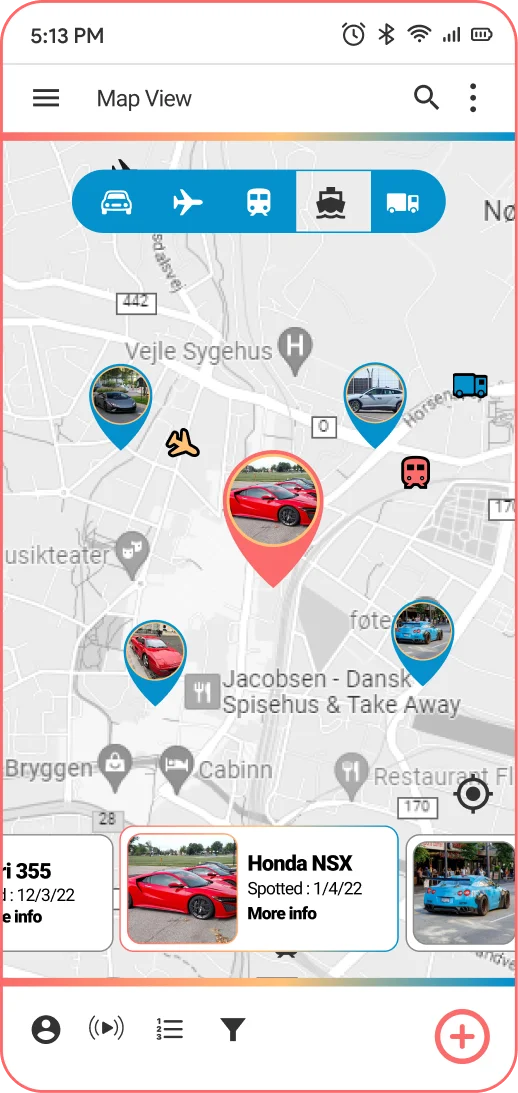
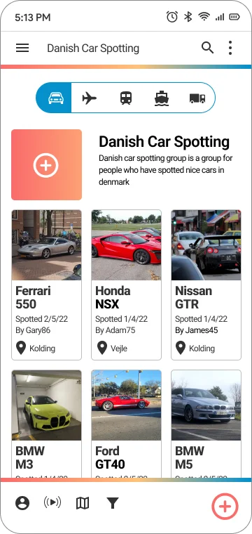
High fid screen mockups
07 / Feedback
Preferecne testing
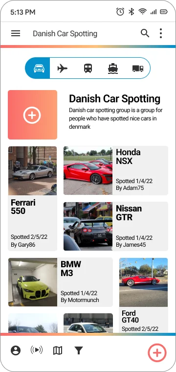
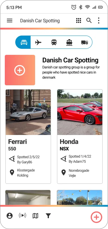
- Option 1 50%
- Option 2 10%
- opti0n 3 40%
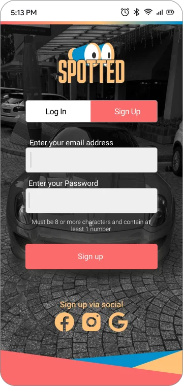
- Option 1 12.5%
- Option 2 75%
- Option 3 12.5%
08 / Design analysis
User feedback
We utilized a strict 12-column grid system to ensure visual consistency across all touchpoints. For typography, we selected ‘Inter’ for its exceptional legibility and neutral character, allowing the brand’s content to take center stage.
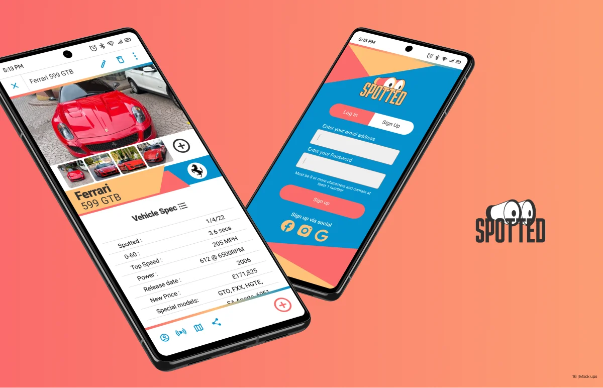
- Vehicle icons in the filter bar made me think it had some navigation aspect to it
- it might make more sense for the profile page to come from the left instead of right.
- When you click on a map marker that isn't centered on the screen,
- The line spacing on the card could be opened up a little bit since you have some extra real estate.
- The vehicle stats are a little hard to read, space them out.
- When I viewed the prototype on my phone, the bottom bar was lower than when viewed on PC,
- Tried to add a spot from the gallery while using my phone and it flipped some of the pictures sideways.
- It seemed hard to back out of add photos page without adding pictures.
- The line spacing on the vehicle history feels a little tight like in the card on the map screen.
- Slider and pop up make map to small
- Not all bottom bars are calibrated correctly
- move filter to a more logical place
- Create more obvious confirm button or double up
Kontakt os, og lad os arbejde sammen :)
Lige nu tilgængelig for freelancejobs og kreative partnerskaber verden over. Lad os bygge noget exceptionelt sammen.