Evaluation
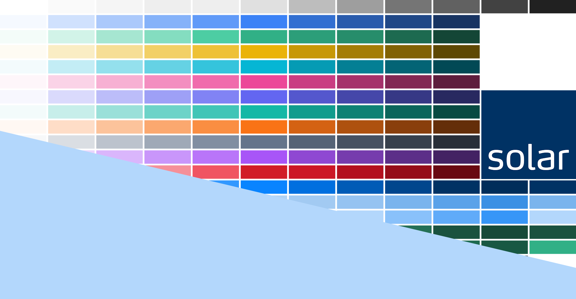
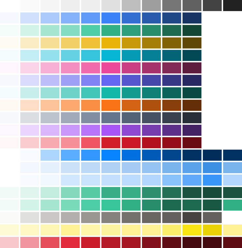
I evealuated the colours and found we have 55 different blues whcih was a great pitch for change.
Brief
Vi havde et enormt antal farver i designsystemet, som skulle reduceres drastisk og tilpasses forskellige regioner og afdelinger. Vi var nødt til at få organiseret det uorganiserede for at reducere forvirring og arbejdsbyrde for alle berørte medarbejdere.
Planning
The initial work flwo seemed simple but the project balloooned as it quickly became clear that changing the colour was not a simple task. Many people had strong opinions that upper managment supported and so navigating the stakeholders was a surprisingly large part of the task here.
I evealuated the colours and found we have 55 different blues whcih was a great pitch for change.
It was important that once the garvity of the situation was uncovered I met with stakeholder from marketing a brand management to align them with my intentions and reasoning
I did a deep analysis of colour rules and graphic break down to give my argumentation solid grounding come presentation time
I carried out an intense and ruthless revamp of the colours taking into consideration the stakeholders input and reduced the colours down to 7 blues from 55
From there on there was persistent back and forth with stakeholders negotiating the rules and colours I had designed until the project was canned. A year later the colours were picked up by an external agency who pushed them through.
We spend a large amount of time just rejecting non compliant work
— Mette b - Head of branding
Problem
Too many colours
We had an unmanageable amount of colours that did not meet accessibility standards and were extremely difficult for UX and Dev to navigate around
CVI governance
Our CVI governance was understaffed and struggled with enforcing colour among other things
Rules
No rule set for new colour or clear guidelines for colour usage.
Design
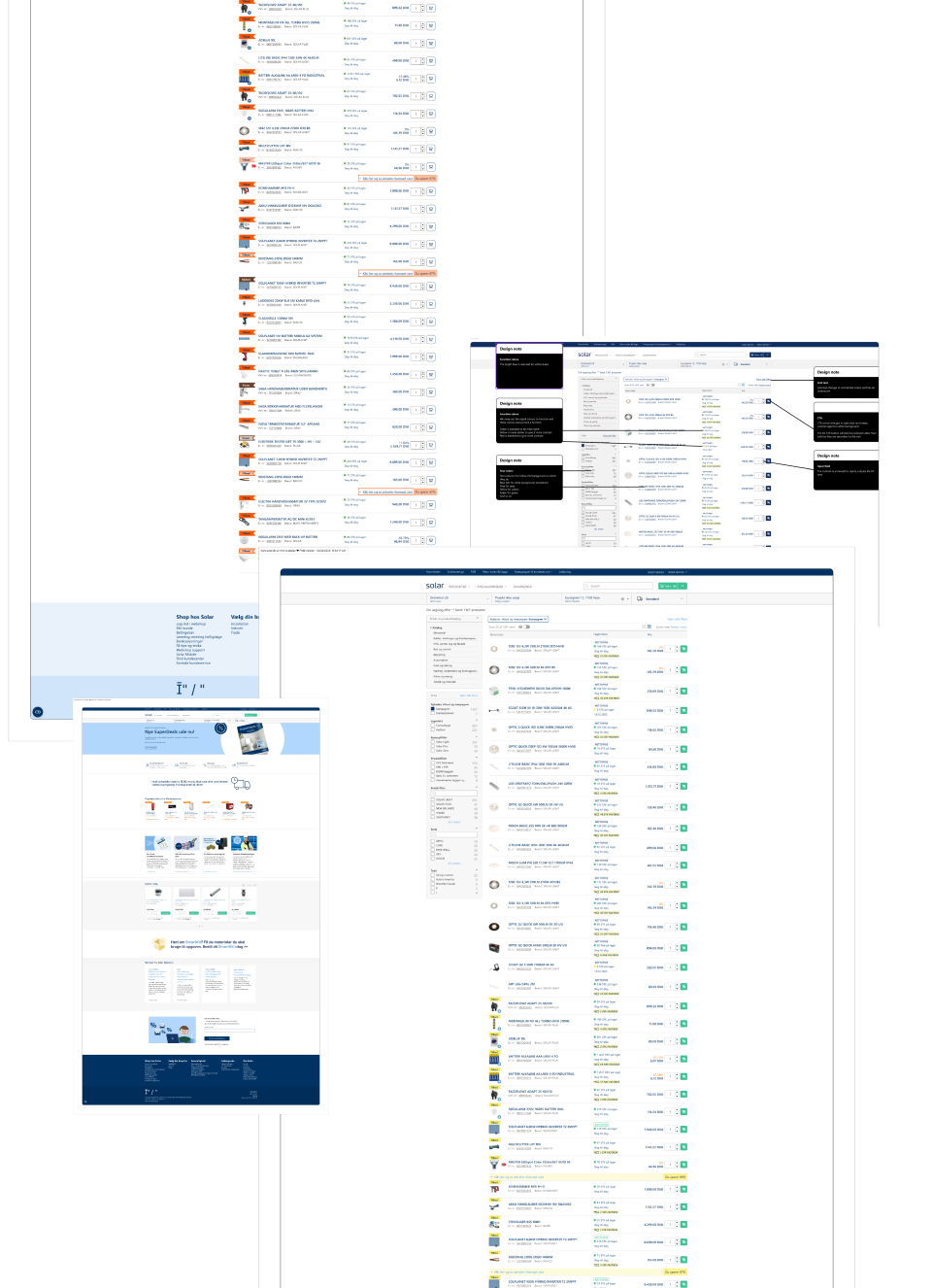
It was cruitial to do mock up of the current site with my new proposals to see if they works as I envisioned and to communicate to stakeholders and eleviate their concerns. Whilst we as designers can easily visualise how a design concept or rule set will function in real life it is much harder for someone with a different skills set to appreciate where we are coming from
Proposals
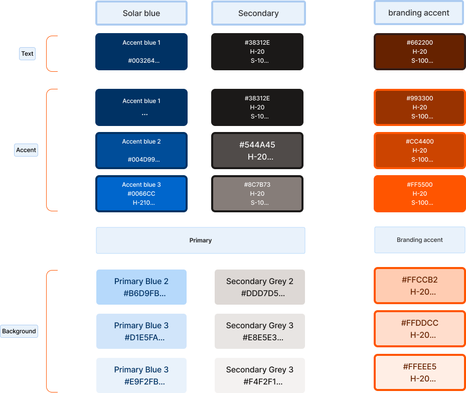
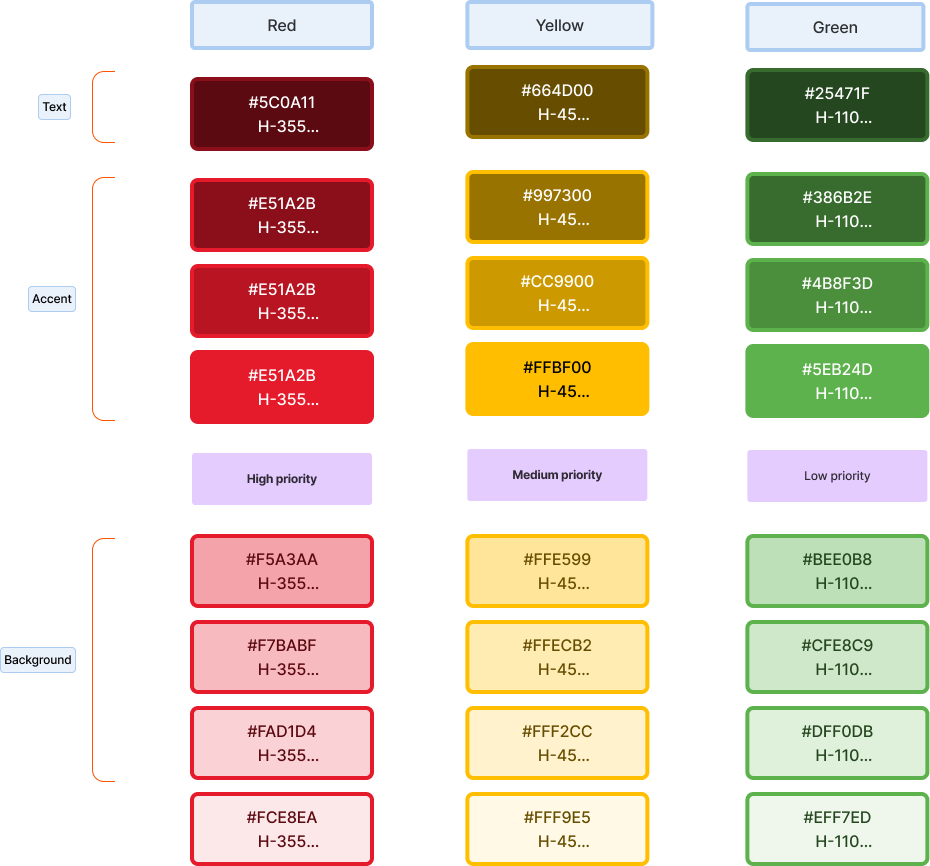
Having created and negotiated the colours I proposed a limited set of main colours and function colours. The main colours were for braning and the function colours were for functional tasks. There had to be a clear rule set because of the challenges that branding governance had with employee freedom. By restricting the colours available it would reduce the workload on the governance team in catching errors.
For accessibility it was important to create clear definitions of text and background colours so there was enough contrast.
These colours I categorised as “graphical” because they primarily were for graphical decoration of the site
Proposals
Additional categories
Every web site need utility colours or as I called them, “function colours” because they had a function and were only used for functions.
They still used the same text, background and accent stratergy
Priority messaging
The function colours were given a usage explanation so that we could determine how to use them.
High priority messages were for messages that would prevent the users from carrying out their task
Medium priority was for message that might prevent them from carrying out their task
Low priority were for task related messages that would have no effect on completing the task
Lige nu tilgængelig for freelancejobs og kreative partnerskaber verden over. Lad os bygge noget exceptionelt sammen.